A shopper is ready to explore your store. Before they can read the product page, a popup asks for their email, phone number, birthday, and preferences. They close it. Another shopper signs up for a discount, then cannot find the code.
Both problems belong to your signup program. Improving Shopify signup forms means making the invitation useful, the interaction easy, and the next step reliable. A higher submission rate matters most when those subscribers become customers who want to hear from you.
These ten fixes cover the journey from first impression to welcome email. Start with the weakest connection in your current setup, then make one deliberate improvement at a time.
Make the value clear before asking for an email
“Join our newsletter” describes your mailing list. It gives shoppers little reason to join it. Replace that vague request with a benefit your brand can consistently deliver: useful product guidance, relevant new releases, early access, or a clearly explained first-order offer.
Your headline, supporting line, and button should tell one coherent story. If the headline promises an offer, explain important restrictions before submission. A minimum spend or excluded collection should not become a surprise at checkout.
Check the economics before increasing the incentive. A larger discount might attract more signups while reducing what you earn from their orders. Choose a promise that fits your margins and your customers’ reasons for buying.
Read the form without your product images or brand context. A first-time visitor should still understand the benefit, what they are signing up for, and what happens next.
Not sure what your signup offer should promise? A free consultation with Senditive can help you discuss the offer, your audience, and the priorities for a clearer invitation.
For a coffee store: “Find your next favorite roast” is a clearer starting point than “Stay in the loop.” Support it with the actual benefit, such as brewing advice and new-roast announcements.
 senditive.com
Match the invitation to the visitor’s reason for coming
A visitor reading a gift guide has a different question from someone comparing refill sizes. Your form should feel relevant to that visit. Start with your main landing pages and ask what shoppers are trying to accomplish on each.
Carry the original message through the journey. If an advertisement promises help choosing a product, an unrelated sitewide offer can interrupt that expectation. A useful signup invitation might instead continue the selection process.
Begin with a few meaningful differences. You do not need a separate form for every traffic source. Group visits by needs your messaging can genuinely address, such as product education, gifting, or a specific collection.
Write down the intended audience, page, promise, and follow-up for each form. If two forms serve the same purpose, simplify the setup before adding more variations.
Avoid treating every advertising click as proof of purchase intent. Someone discovering the category may need orientation, while a returning product researcher may need a specific answer before joining.
Interactive checklist
Check your signup journey
Tick only the checks you have verified. Your next unchecked priority updates as you go.
Your next priority
Start with consent and confirmation
Confirm what the person agrees to and what happens after submitting. If confirmation is required in your setup, test that step before reviewing the welcome journey.
Read the consent and confirmation guidanceWant to discuss what to prioritize for your store? Book a free consultation with Senditive.
Your selections stay on this page.
senditive.comChoose a format and timing that respect the page
Your signup strategy can include more than a popup. Shopify themes can provide newsletter sections or footer signup options. An embedded form gives interested visitors a place to subscribe without waiting for an overlay.
Use a popup when the invitation warrants attention, and consider a smaller banner when access to the page matters more. Google advises against intrusive interstitials that obscure content and recommends banners occupying a small part of the screen.
There is no universally correct delay. Choose a starting trigger based on the page’s purpose, then test it. Shoppers should have a chance to understand what they are browsing before being asked for another commitment.
Review what else appears at the same moment. A signup prompt competing with a cookie notice and chat window can make a simple page difficult to use.
Reference: Shopify Help Center: Add a newsletter signup; Google Search Central: Avoid intrusive interstitials and dialogs.
 senditive.com
Make the mobile form easy to finish and close
A form can look polished in an editor and become awkward as soon as the phone keyboard opens. Test it on a real device: tap the field, enter an address, correct a mistake, submit, and return to shopping.
Keep the main benefit, input, button, and dismissal control easy to find. Remove decorative content that pushes the task out of view. Closing the invitation should be straightforward; a reluctant signup is a poor substitute for a shopper who can comfortably browse.
Use readable labels and a clear relationship between each label and its field. W3C’s accessibility guidance explains why properly associated labels matter for people using screen readers and other input methods.
Also check text contrast, error messages, and the success state. A vague “Something went wrong” leaves shoppers guessing. Tell them what needs correcting without making them re-enter information unnecessarily.
Reference: W3C Web Accessibility Initiative: Labeling Controls.
Try it on your signup copy
Build a clearer signup invitation
Choose a starting offer, edit the copy and follow it into the welcome email. Keep the promise consistent from one step to the next.
Edits stay in this preview.
Be first to discover what is next
Get early access to new releases, plus useful product emails. Stay close to the products you love.
Select the button to explore the confirmation and welcome email.
Next-step preview
Set the expectation for early access
The next step should explain when subscribers hear about a release and what early access includes.
Welcome email preview
Subject: Welcome to a first look at what is next
Be first to discover what is next
Get early access to new releases, plus useful product emails. Stay close to the products you love.
Confirm how early-access emails work and introduce the products or collections worth exploring now.
The same promise continues into the first email.
senditive.comChoose an offer or edit the copy to begin.
senditive.comAsk only for information you will use
Every field should have a job. An email address may be enough to begin the relationship. Add a preference question when the answer changes a product recommendation or a future message, and decide how that information will be used before collecting it.
For example, a pet brand might ask whether someone shops for a cat or a dog. Collecting an entire pet profile before the first welcome email needs a stronger reason.
If you also want SMS subscribers, make that a separate, understandable choice. Klaviyo’s integration guidance explicitly separates SMS consent from email consent. Providing an email address should not silently enroll someone in another channel.
A multistep form can separate these decisions, but more steps are not automatically better. Review where people stop, what they agreed to at each stage, and whether their original email signup succeeds when they decline SMS.
Reference: Klaviyo Developer Portal: Integrate a forms and popups platform.
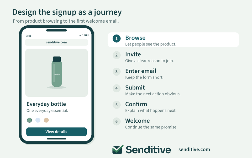
Make consent and confirmation part of the experience
Explain what people are subscribing to in language they can read before submitting. Keep the disclosure consistent with the messages you actually plan to send. A vague reference to “updates” is unhelpful if the experience is mostly promotional.
Check whether your destination list uses single or double opt-in. With double opt-in, the person must confirm before being subscribed to that list. The success message should explain this next step so shoppers know to check their inbox.
Treat missing confirmations as a journey to investigate. Test the confirmation message, destination, and sender setup before assuming people have lost interest.
Choose settings for the markets and channels you serve. Double opt-in does not replace appropriate disclosures or every other requirement. Shopify also cautions that automated consent settings are not a substitute for checking your obligations. Keep this review focused on your actual setup.
Reference: Klaviyo: Understanding the double opt-in process; Shopify Help Center: Collecting customer contact information.
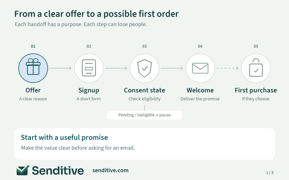
Connect the signup promise to the welcome email
The form and the first email should feel like the same conversation. Someone who requested product advice should receive useful guidance. Someone promised a code should understand where to find it and how to use it.
Check the connection between the form, destination list, consent status, and welcome flow. Klaviyo’s welcome-series guidance explains how signup sources should feed the relevant list and how confirmation affects entry into a list-triggered welcome series.
Carry useful context forward. A preference collected on the form should influence the experience where appropriate, with sensible fallback content when that information is missing.
Then test the promise itself. Does the link open the intended page? Does the offer apply to an eligible cart? Is the next email still suitable if the subscriber purchases immediately?
Reference: Klaviyo: How to create an email welcome series.
 senditive.com
Measure customer quality and test one hypothesis
Start by checking what your signup rate measures. Klaviyo’s form overview uses total submitted events divided by total viewed events, while its A/B test reporting uses unique measures. Those figures are not interchangeable.
Follow the journey beyond submission: confirmation where required, welcome delivery, first orders, and the value of those orders after incentives. Break results down by device or acquisition source when the differences are meaningful. Form-attributed revenue alone does not establish that the form caused additional sales.
Next, write a specific hypothesis: “Clarifying the offer restriction will reduce confusion without reducing qualified signups.” Change that element while keeping the audience, offer, and other conditions comparable.
Decide your main outcome and review plan before launching. Avoid declaring a winner after a handful of orders. If volume is limited, acknowledge the uncertainty rather than turning a small difference into a confident conclusion.
When testing timing, compare the people eligible to see each version. Comparing only those who actually saw a later form can hide the visitors who left before it appeared.
If you need help choosing what to measure and test first, use your free consultation with Senditive to discuss a focused plan for your forms and follow-up emails.
Reference: Klaviyo: Understanding sign-up form analytics; Klaviyo: How to A/B test a sign-up form.
Compare your test
Which signup version brought better business results?
Compare the signup rate with first-order outcomes before choosing a version.
Use comparable eligible traffic. For each version, count first orders and revenue only from that version’s signup cohort, measured over the same fixed follow-up window.
Clear results removes both versions’ entries and resets the comparison.
Enter both versions, then choose Compare results.
Your results
Signup rate
- Version A
- Version B
First orders per 1,000 eligible visitors
- Version A
- Version B
First-order revenue per eligible visitor (USD)
- Version A
- Version B
Signup-rate difference: B vs A
Compare both versions to see the difference.
Revenue-per-visitor difference: B vs A
Compare both versions to see the difference.
The version with a higher signup rate may differ from the version with more first-order revenue per eligible visitor.
Descriptive comparison, not a statistical significance test. Revenue is not profit. Displayed values are rounded; comparisons use unrounded values.
How these numbers are calculated
- Signup rate = signups ÷ eligible visitors × 100.
- First orders per 1,000 eligible visitors = first orders ÷ eligible visitors × 1,000.
- First-order revenue per eligible visitor = cohort first-order revenue ÷ eligible visitors.
- Relative difference = (version B’s rate − version A’s rate) ÷ version A’s rate × 100. A zero baseline has no defined relative percentage.
Need help interpreting the results? Book a free consultation.
senditive.comStop showing the same invitation to existing subscribers
Someone who has already subscribed should not repeatedly receive the same first-time invitation. Review audience exclusions and the settings controlling when a dismissed or completed form can appear again.
In Klaviyo, visitor targeting and display frequency can help manage this. Check exactly which audience you are excluding: all recognized profiles and confirmed email subscribers are not the same group.
Recognition has limits. Klaviyo explains that targeting relies on cookies; a new device, private browsing, or cleared cookies can make an existing subscriber appear anonymous. Test both recognized and unrecognized visits before treating every repeat display as a broken rule.
If an email subscriber is invited to join SMS, explain the additional value and preserve their choice. That is a different invitation from asking them to join the email list again. Give each form a distinct purpose.
Reference: Klaviyo: Understanding targeting and behavior settings for sign-up forms.
senditive.comCheck the full journey after every meaningful change
Publishing is the start of maintenance. Theme updates, new apps, changed offers, and edited lists can affect an experience that previously worked. Assign someone to check the signup journey after changes that could disrupt it.
Klaviyo recommends publishing and testing forms in a clean browser environment while meeting their targeting rules. Also run a separate check as a recognized subscriber; the correct experience may be for the form to stay hidden.
Your check should cover display, dismissal, field validation, consent, list entry, confirmation, welcome delivery, and offer redemption. Include an invalid address, a declined SMS step, and a returning visit where relevant.
Keep a short record of the form’s purpose, audience, destination, active offer, and latest test. This gives the next person enough context to maintain it. A signup program becomes easier to improve when its basic connections remain dependable.
When you retire an offer, check every place it appears: the form, success message, confirmation instructions, and welcome email. Updating only the headline can leave an old promise active elsewhere.
Reference: Klaviyo: Getting started with sign-up forms.
Shopify signup form FAQs
What is a good Shopify signup form conversion rate?
There is no single rate that suits every store. Compare consistent definitions and similar audiences, then examine confirmation and first-order quality. Device, traffic source, form format, and the offer can change what a useful comparison looks like.
Should my Shopify signup form offer a discount?
Only if the offer fits your margins and positioning. Product guidance, relevant new-release updates, or early access can provide value too. Judge the offer by the customers it attracts and what they do after subscribing.
When should a Shopify popup appear?
Choose a starting trigger that suits the page, then test it with comparable eligible visitors. Avoid copying a fixed delay without context. Protect access to the content and make dismissal easy, particularly on mobile.
Why does someone submit a form but not receive a welcome email?
Check the destination list, confirmation status, flow trigger, filters, and message status. With a double-opt-in list, an unconfirmed signup will not enter its list-triggered welcome series. Test the complete path with a new profile.
Make the next signup more useful
Better Shopify signup forms begin with a clear promise and end with a reliable next step. Fix confusing offers, unnecessary fields, or broken handoffs before spending time on small design variations. Then test a focused change and judge it by the relationship that follows.
Sources and further reading
- Shopify Help Center: Add a newsletter signup
- Klaviyo: Understanding targeting and behavior settings for sign-up forms
- Google Search Central: Avoid intrusive interstitials and dialogs
- W3C Web Accessibility Initiative: Labeling Controls
- Klaviyo Developer Portal: Integrate a forms and popups platform
- Klaviyo: Understanding the double opt-in process
- Klaviyo: How to create an email welcome series
- Klaviyo: Understanding sign-up form analytics
- Klaviyo: How to A/B test a sign-up form
- Klaviyo: Getting started with sign-up forms
- Shopify Help Center: Collecting customer contact information